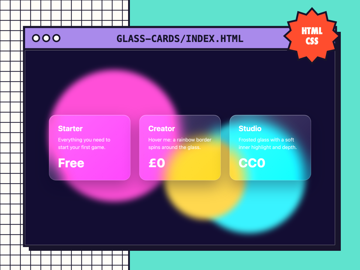
Glass Cards with Glow Border
Frosted glassmorphism cards with an animated rainbow border on hover, with a solid fallback for older browsers.
⚑ Report this
Frosted glassmorphism cards with an animated rainbow border on hover, with a solid fallback for older browsers.
The download has a working demo (index.html) plus the files to copy. The key file is shown below with a Copy button.
/* Glass Cards with Glow Border · Cube Burst Studios · CC0
   <article class="glass"><h3>Title</h3><p>Text</p></article>  (put them over something colourful) */
.glass {
	position: relative; isolation: isolate; padding: 28px; border-radius: 22px; color: #fff;
	background: linear-gradient(135deg, rgba(255,255,255,.22), rgba(255,255,255,.06));
	border: 1px solid rgba(255,255,255,.28);
	backdrop-filter: blur(18px) saturate(1.4); -webkit-backdrop-filter: blur(18px) saturate(1.4);
	box-shadow: 0 20px 50px rgba(10, 5, 40, .35), inset 0 1px 0 rgba(255,255,255,.35);
	transition: transform .3s ease;
}
/* animated gradient border, only visible on hover */
.glass::before {
	content: ""; position: absolute; inset: -2px; z-index: -1; border-radius: inherit; padding: 2px;
	background: conic-gradient(from var(--angle, 0deg), #ff4fd8, #39f3ff, #b6ff4f, #ff4fd8);
	-webkit-mask: linear-gradient(#000 0 0) content-box, linear-gradient(#000 0 0); -webkit-mask-composite: xor; mask-composite: exclude;
	opacity: 0; transition: opacity .3s ease; animation: glass-spin 4s linear infinite;
}
.glass:hover { transform: translateY(-6px); }
.glass:hover::before { opacity: 1; }
@property --angle { syntax: "<angle>"; initial-value: 0deg; inherits: false; }
@keyframes glass-spin { to { --angle: 360deg; } }
@supports not (backdrop-filter: blur(1px)) { .glass { background: rgba(40, 30, 90, .85); } }
@media (prefers-reduced-motion: reduce) { .glass, .glass::before { transition: none; animation: none; } }
MORE
WEB DEV
View all ↗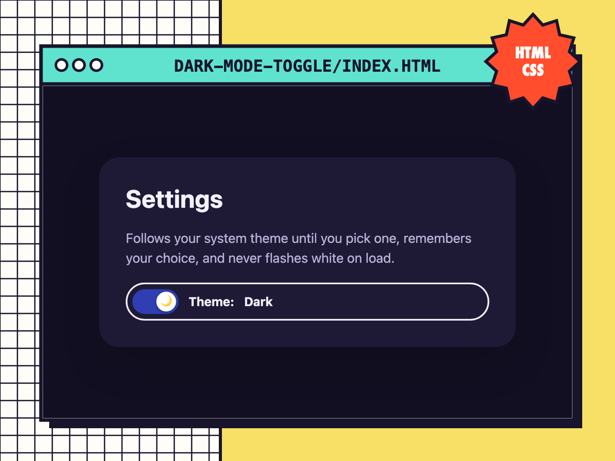
Dark Mode Toggle (No Flash)
An accessible theme switch that follows the system setting, remembers the visitor's choice and never flashes white on load.
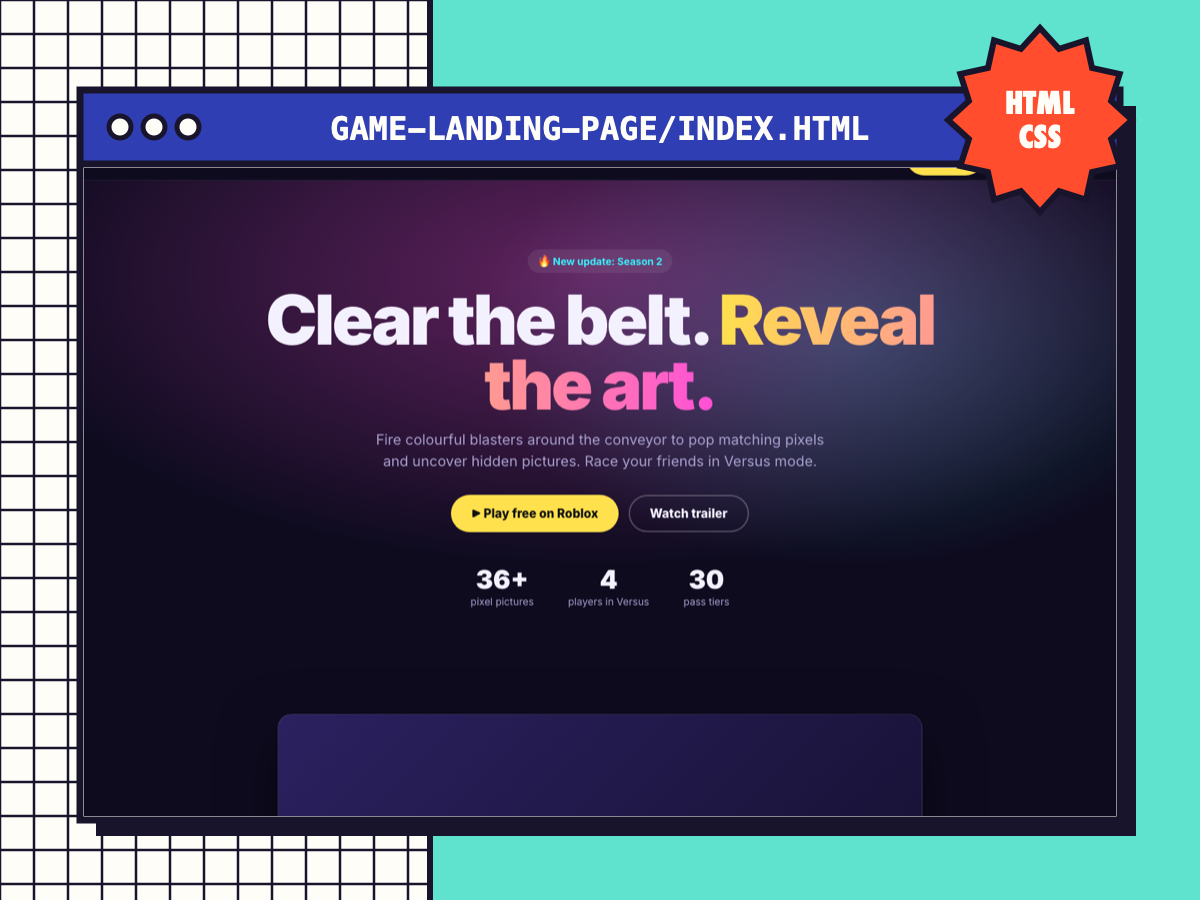
Game Landing Page Template
A complete one-page site for your game: sticky nav, hero with Play button, trailer slot, features, FAQ and a call-to-action band.
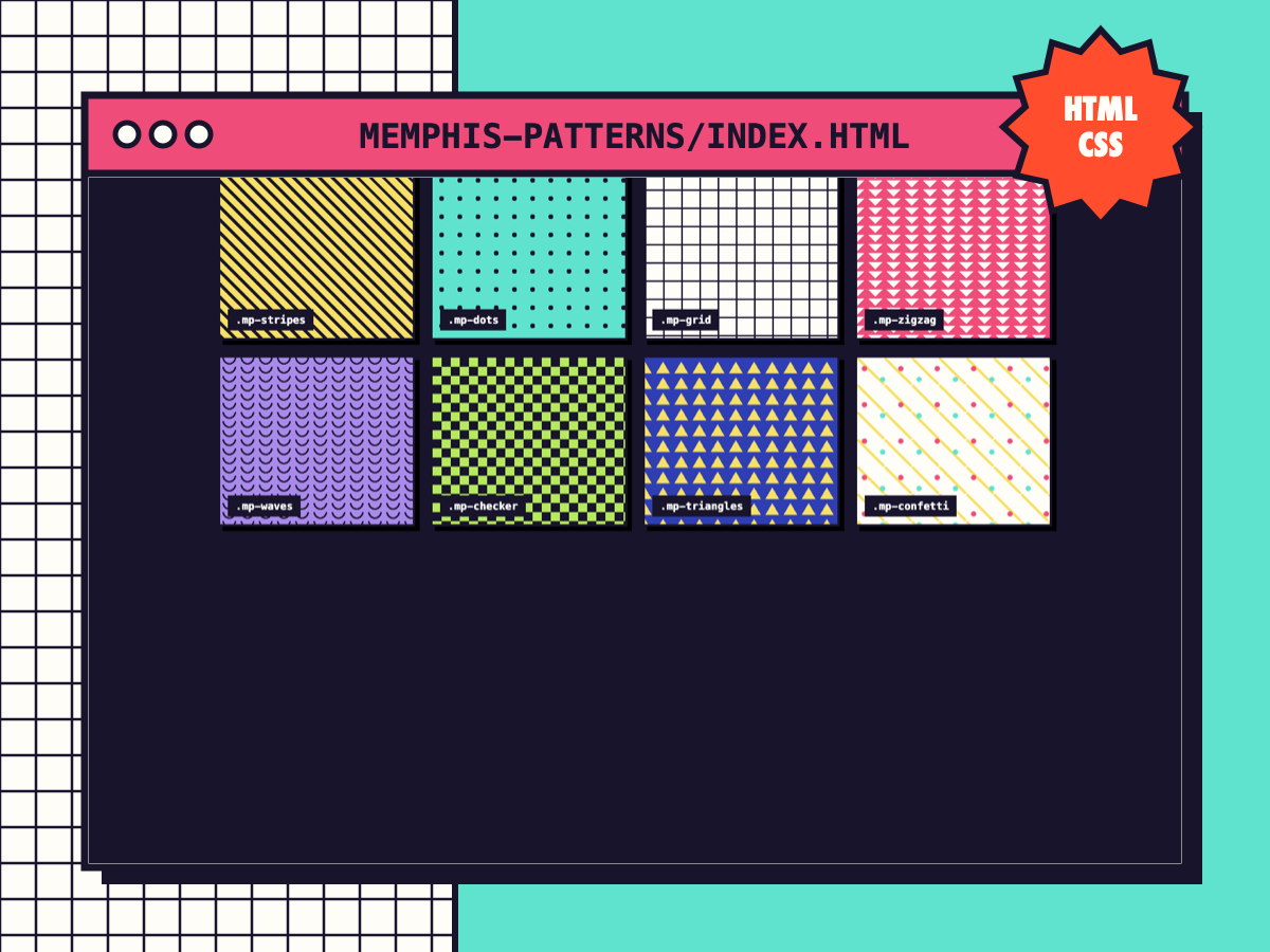
Memphis Pattern Backgrounds
Eight pure-CSS repeating patterns (stripes, dots, grid, zigzag, waves, checker, triangles, confetti). Recolour with two variables.
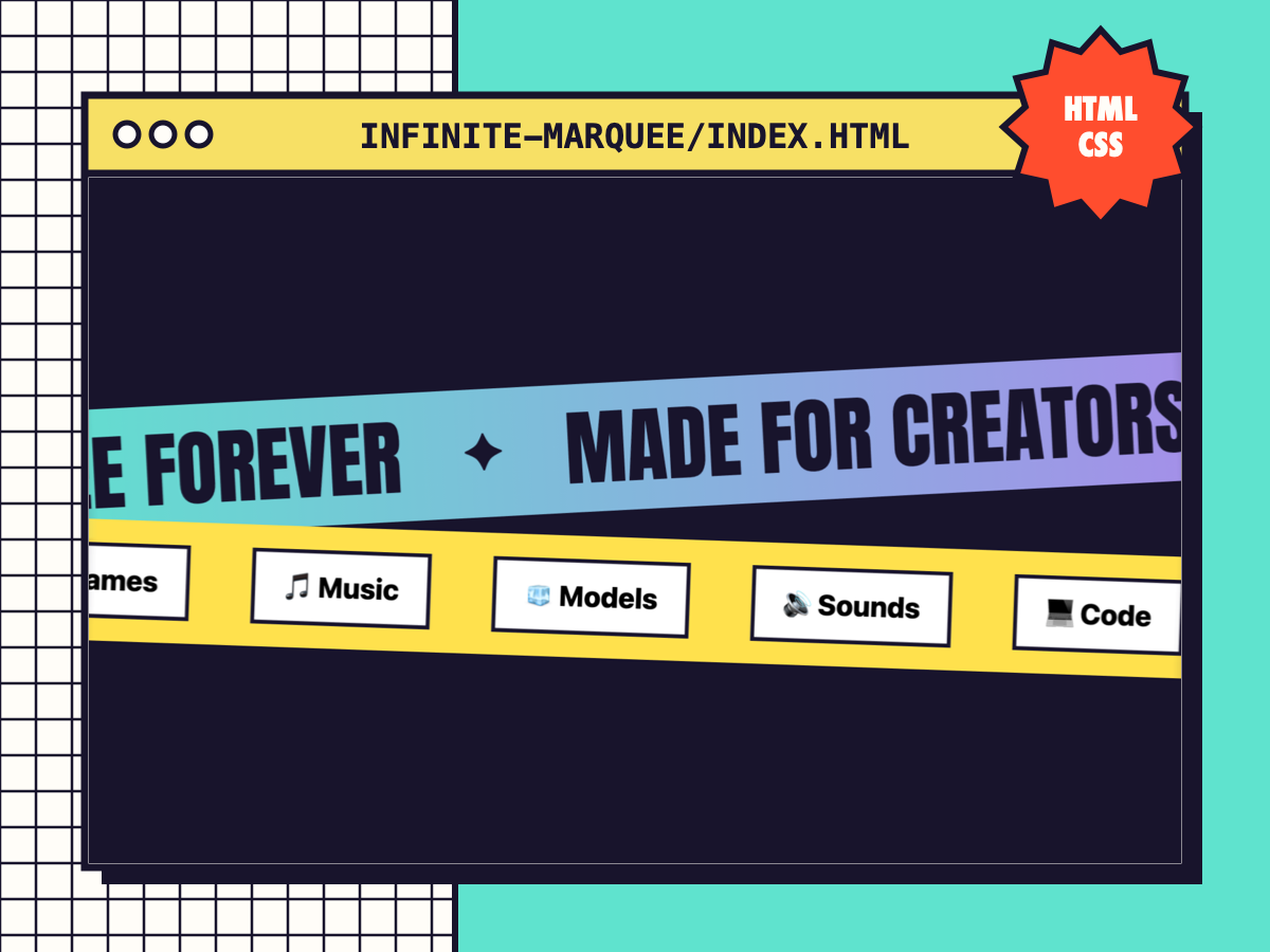
Infinite Marquee (Accessible)
A seamless scrolling ticker that pauses on hover/focus and stops for reduced-motion users. Works with text, chips or logos.