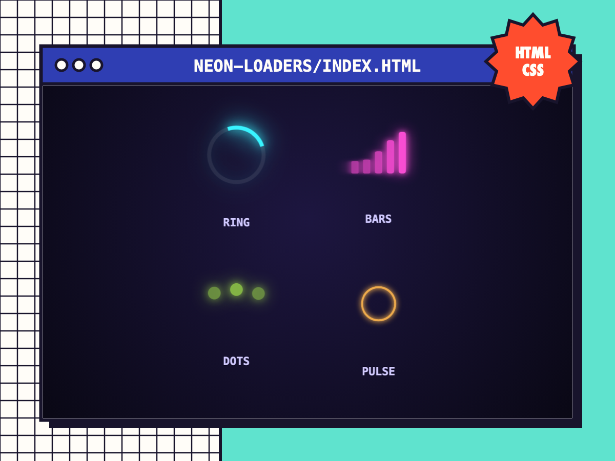
Neon Loaders (4 styles)
Four glowing CSS loading animations (ring, bars, dots and pulse), recolourable with one variable and screen-reader friendly.
⚑ Report this
Four glowing CSS loading animations (ring, bars, dots and pulse), recolourable with one variable and screen-reader friendly.
The download has a working demo (index.html) plus the files to copy. The key file is shown below with a Copy button.
/* Neon Loaders · Cube Burst Studios · CC0
   <div class="nl-ring"></div>  <div class="nl-bars"><i></i><i></i><i></i><i></i><i></i></div>
   <div class="nl-dots"><i></i><i></i><i></i></div>  <div class="nl-pulse"></div>
   Recolour with --neon. Add role="status" aria-label="Loading" for screen readers. */
:root { --neon: #39f3ff; }
.nl-ring { width: 64px; height: 64px; border-radius: 50%; border: 5px solid rgba(255,255,255,.08); border-top-color: var(--neon);
	filter: drop-shadow(0 0 6px var(--neon)) drop-shadow(0 0 14px var(--neon)); animation: nl-spin .9s linear infinite; }
.nl-bars { display: flex; gap: 6px; align-items: flex-end; height: 56px; }
.nl-bars i { width: 9px; height: 100%; background: var(--neon); border-radius: 3px; box-shadow: 0 0 8px var(--neon), 0 0 18px var(--neon);
	animation: nl-bar 1s ease-in-out infinite; transform-origin: bottom; }
.nl-bars i:nth-child(2) { animation-delay: .1s } .nl-bars i:nth-child(3) { animation-delay: .2s } .nl-bars i:nth-child(4) { animation-delay: .3s } .nl-bars i:nth-child(5) { animation-delay: .4s }
.nl-dots { display: flex; gap: 12px; }
.nl-dots i { width: 16px; height: 16px; border-radius: 50%; background: var(--neon); box-shadow: 0 0 10px var(--neon), 0 0 22px var(--neon); animation: nl-dot 1.2s ease-in-out infinite; }
.nl-dots i:nth-child(2) { animation-delay: .2s } .nl-dots i:nth-child(3) { animation-delay: .4s }
.nl-pulse { width: 60px; height: 60px; border-radius: 50%; border: 4px solid var(--neon); box-shadow: 0 0 12px var(--neon), inset 0 0 12px var(--neon); animation: nl-pulse 1.4s ease-out infinite; }
@keyframes nl-spin { to { transform: rotate(360deg); } }
@keyframes nl-bar { 0%, 100% { transform: scaleY(.25); opacity: .6 } 50% { transform: scaleY(1); opacity: 1 } }
@keyframes nl-dot { 0%, 100% { transform: translateY(0); opacity: .5 } 40% { transform: translateY(-14px); opacity: 1 } }
@keyframes nl-pulse { 0% { transform: scale(.6); opacity: 1 } 100% { transform: scale(1.3); opacity: 0 } }
@media (prefers-reduced-motion: reduce) { .nl-ring, .nl-bars i, .nl-dots i, .nl-pulse { animation-duration: 3s; } }
MORE
WEB DEV
View all ↗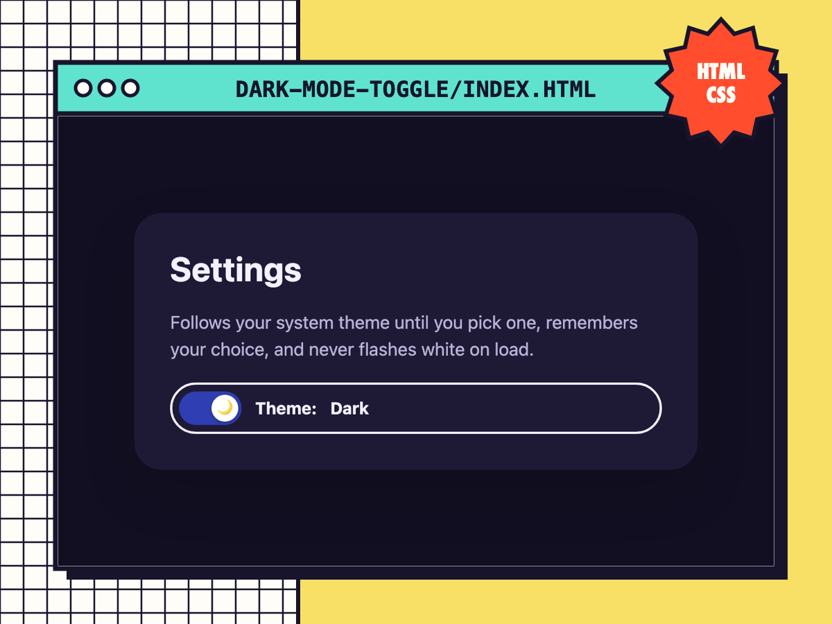
Dark Mode Toggle (No Flash)
An accessible theme switch that follows the system setting, remembers the visitor's choice and never flashes white on load.
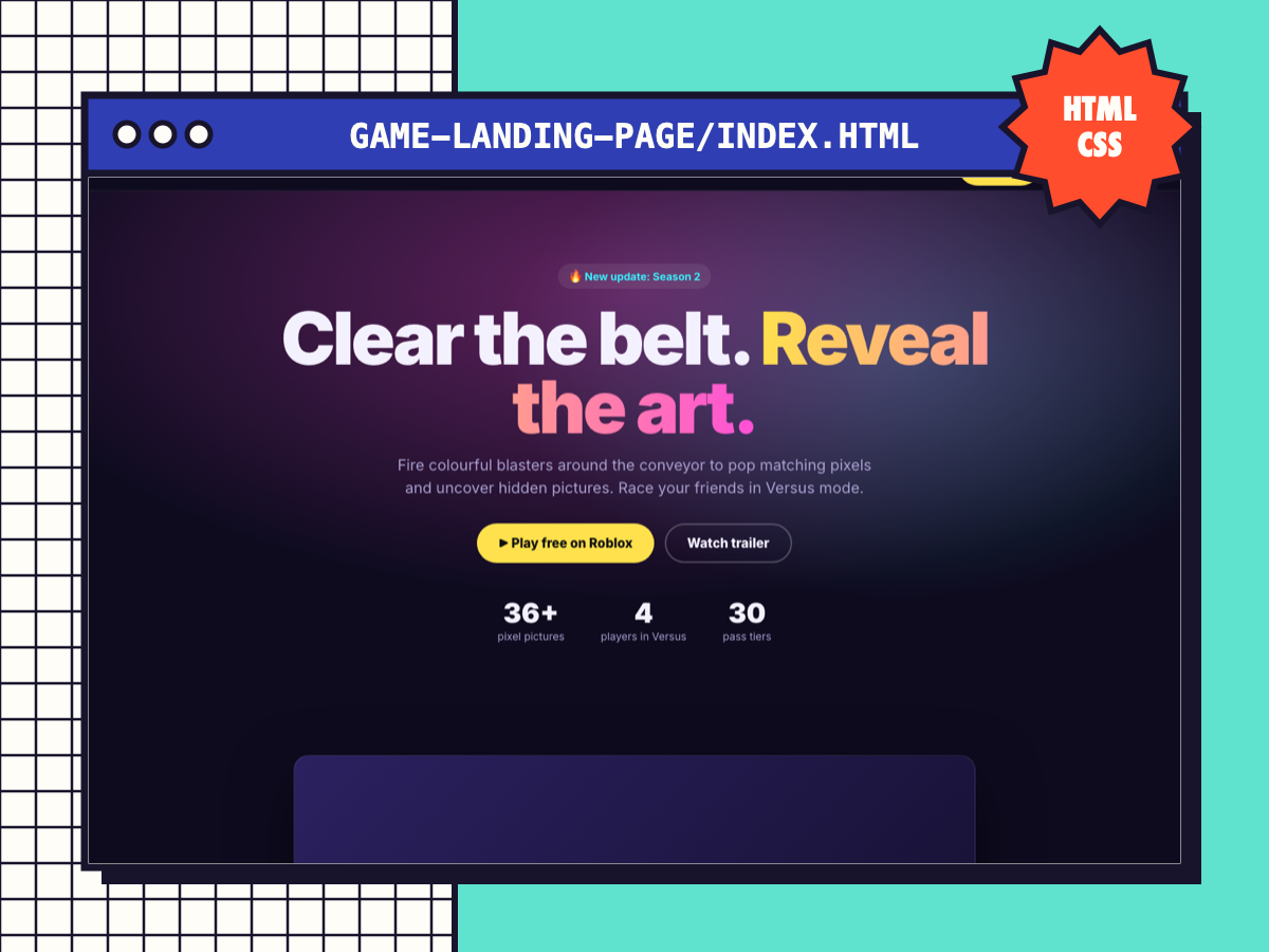
Game Landing Page Template
A complete one-page site for your game: sticky nav, hero with Play button, trailer slot, features, FAQ and a call-to-action band.
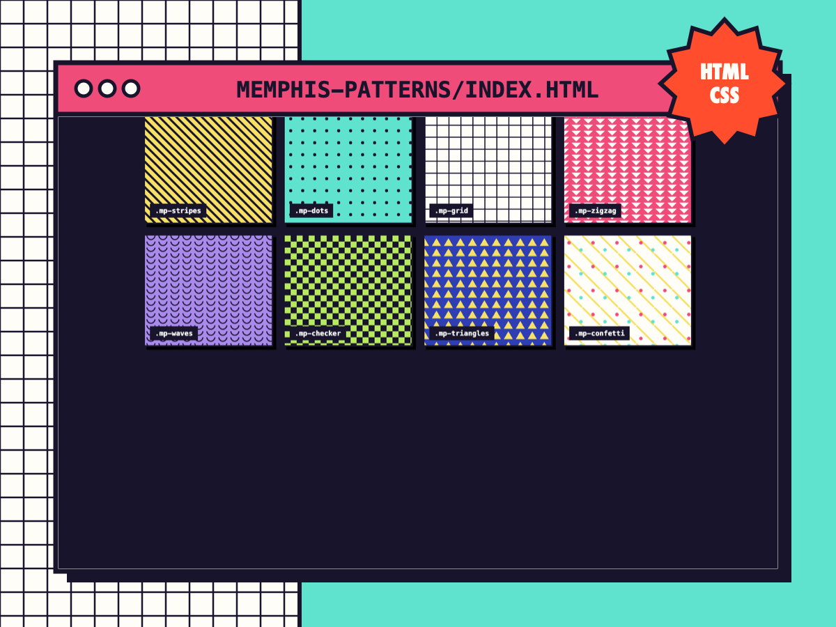
Memphis Pattern Backgrounds
Eight pure-CSS repeating patterns (stripes, dots, grid, zigzag, waves, checker, triangles, confetti). Recolour with two variables.
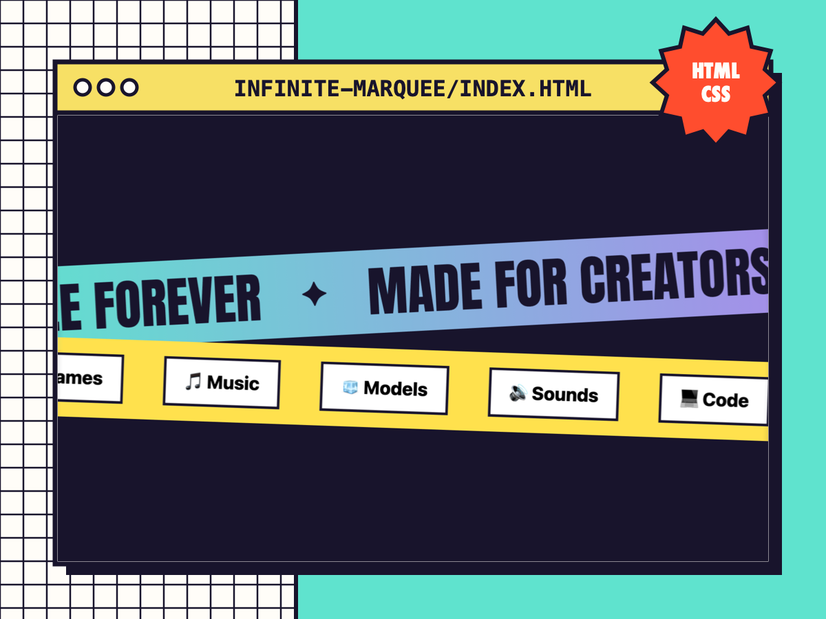
Infinite Marquee (Accessible)
A seamless scrolling ticker that pauses on hover/focus and stops for reduced-motion users. Works with text, chips or logos.